


Hi friends! I'm hudy. A web developer from Hanoi, Vietnam
In this post, I'm gonna show you how to build a Notebook app - desktop application - using Tauri and ReactJS.
For those who don't know Tauri, it is a toolkit that helps developers make applications for the major desktop platforms - using virtually any frontend framework in existence
A tutorial video:
{% embed https://www.youtube.com/embed/2E5edr4_LXw %}
The source code for this tutorial is available here: https://github.com/hudy9x/tauri-notebook
Prerequisite
Table of contents
- Install Tauri
- Scaffolding code structure using
create-tauri-app - Using Tiptap library in
<MainEditor/>and create<Menubar/> - Time to style
- Change app's icon
- Build app
#1. Install Tauri
The first step is to intall Rust and it's dependencies. Visit Tauri's home page to get it done
- For window users: check this [link](https://tauri.app/v1/guides/getting- started/prerequisites#setting-up-windows)
- For macOs users: check this link
- For Linux users: check this link
#2. Scaffolding code structure using create-tauri-app
Make sure that you've installed npm already. Then, run the following command to generate code structure
$ npm create tauri-app
Follow the instructions. Just remember to select react-ts as main framework

Now, time to install tiptap and remixicon
$ npm install @tiptap/react @tiptap/starter-kit remixicon
Next, create a components folder with 2 files inside it as Editor.tsx and Menubar.tsx. And add a simple component definition to them

#3. Using Tiptap library in <MainEditor/> and create <Menubar/>
Open src/components/MainEditor.tsx and add the following code:
// src/components/MainEditor.tsx
import { EditorContent, useEditor } from "@tiptap/react";
import StarterKit from "@tiptap/starter-kit";
import Menubar from "./Menubar";

export default function MainEditor() {
  const editor = useEditor({
    extensions: [StarterKit],
    content: `<h2>Hello world</h2>`
  })
  return <>
    {editor ? <Menubar editor={editor} /> : null}
    <EditorContent editor={editor} />
  </>
}
Next, open src/components/Menubar.tsx
// src/components/Menubar.tsx
import {Editor} from '@tiptap/react'

interface IMenubarProp {
  editor: Editor
}

export default function Menubar({editor}: IMenubarProp) {
  const getFocus = () => editor.chain().focus()
  const isActive = (type: string, options?: any) => {
    return editor.isActive(type, options ?? {}) ? 'is-active' : ''
  }

  const menus = [
    [
      {icon: 'bold', onClick: () => getFocus().toggleBold().run(), isActive: isActive('bold')},
      {icon: 'italic', onClick: () => getFocus().toggleItalic().run(), isActive: isActive('italic')},
      {icon: 'strikethrough', onClick: () => getFocus().toggleStrike().run(), isActive: isActive('strike')},
      {icon: 'code-line', onClick: () => getFocus().toggleCode().run(), isActive: isActive('code')},
    ],
    // ...
  ]

  return <div className="menu">
    {menus.map(group => {
      return <div className="group-item">
        {group.map(item => {
          return  <button className="menu-item" onClick={item.onClick}>
        <i className={`ri-${item.icon} ${item.isActive}`}></i>
      </button>

        })}
      </div>
          })}
  </div>
}
After that, just import <MainEditor/> to App.tsx
// src/App.tsx
import MainEditor from "./components/MainEditor";
import './App.css'
export default function App() {
  return <MainEditor />
}
Run app to check the result
$ npm run tauri dev

#4. Time to style
Alright, everything work well so far. But we still have no style for the app.
Let's add style to src/App.css file
.menu {
  display: flex;
  gap: 0.5rem;
  padding: 0 1rem;
  position: fixed;
  z-index: 10;
}

.group-item {
  display: flex;
  gap: 0.5rem;
}

.menu-item {
  padding: 0.5rem 0.75rem
}

.menu-item .is-active {
  color: #55db55;
}

// Editor css

.ProseMirror {
  padding: 1rem;
  outline: none;
  padding-top: 2.5rem;
}

.ProseMirror >
 * + * {
     margin-top: 0.75em;
}
 .ProseMirror ul, .ProseMirror ol {
     padding: 0 1rem;
}
 .ProseMirror h1, .ProseMirror h2, .ProseMirror h3, .ProseMirror h4, .ProseMirror h5, .ProseMirror h6 {
     line-height: 1.1;
}
 .ProseMirror code {
     background-color: rgba(97, 97, 97, 0.1);
     color: #616161;
}
 .ProseMirror pre {
     background: #0d0d0d;
     color: #fff;
     font-family: 'JetBrainsMono', monospace;
     padding: 0.75rem 1rem;
     border-radius: 0.5rem;
}
 .ProseMirror pre code {
     color: inherit;
     padding: 0;
     background: none;
     font-size: 0.8rem;
}
 .ProseMirror img {
     max-width: 100%;
     height: auto;
}
 .ProseMirror blockquote {
     padding-left: 1rem;
     border-left: 2px solid rgba(13, 13, 13, 0.1);
}
 .ProseMirror hr {
     border: none;
     border-top: 2px solid rgba(13, 13, 13, 0.1);
     margin: 2rem 0;
}

// Scrollbar css
::-webkit-scrollbar {
  width: 14px;
  height: 14px;
}

::-webkit-scrollbar-button {
  display: none;
  width: 0;
  height: 0;
}

::-webkit-scrollbar-corner {
  background-color: transparent;
}

::-webkit-scrollbar-thumb {
  border: 4px solid rgba(0, 0, 0, 0);
  background-clip: padding-box;
  border-radius: 8px;
  background-color: rgb(182, 182, 182);
}

::-webkit-scrollbar-track {
  border: 4px solid transparent;
  background-clip: padding-box;
  border-radius: 8px;
  background-color: transparent;
}
Looks good hah ? 😁

#5. Change app's icon (optional)
By default, Tauri has a default icon. If you want to change it to another using my tool here
Prepare an icon in .PNG format that has size of 1024px x 1024px. And it's name must be 1024x1024. Now clone the tool and install packages
$ git clone https://github.com/hudy9x/tauri-icon-converter
$ cd tauri-icon-converter && npm install
And then, copy the icon to /tauri-icon-converter folder and run the below command
$ node .
After genereting process finished, you guys can see a list of icon in /tauri-icon-converter/outputs
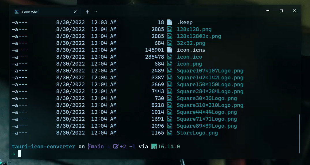
Just replace all of them, but .keep file to /src-tauri/icons folder
You could also verify by running npm run tauri dev. If the icon showed as below then everything work well

#6. Build app
Time to package our app to .msi file. Open terminal and run the following
$ npm run tauri build
If you guys got an error like below
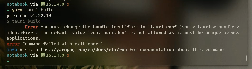
That's because your indentifier not unique. Just open src-tauri/tauri.conf.json and change value to a new one. I changed mine to com.notebook.dev

Ok, run the command npm run tauri dev again. And see the result
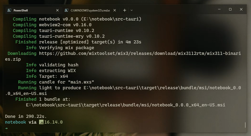
After building process finished you can see the output path like above
Conclusion
So far, you've learnt how to build a desktop application using Tauri and Reactjs.
You can also improve this app by providing some personal feature like auto update, sign-in, theme, ...etc
Thank you for reading!